IN WHAT WAYS DOES YOUR MEDIA PRODUCT USE,DEVELOP OR CHALLENGE FORMS AND CONVENTIONS OF REAL MEDIA PRODUCTS?
My music magazine both used, developed and challenged the normal codes and conventions of already existing music magazines I think.
How it used them...
-I designed my logo for my magazine so that it conformed to the normal codes and conventions, as most music magazine have a bold title with sometimes it going slightly behind the main image or another feature. This is normally a sign that the magazine is already well recognised which is why I did it to my magazine, as well it meaning that it is using the conventions.
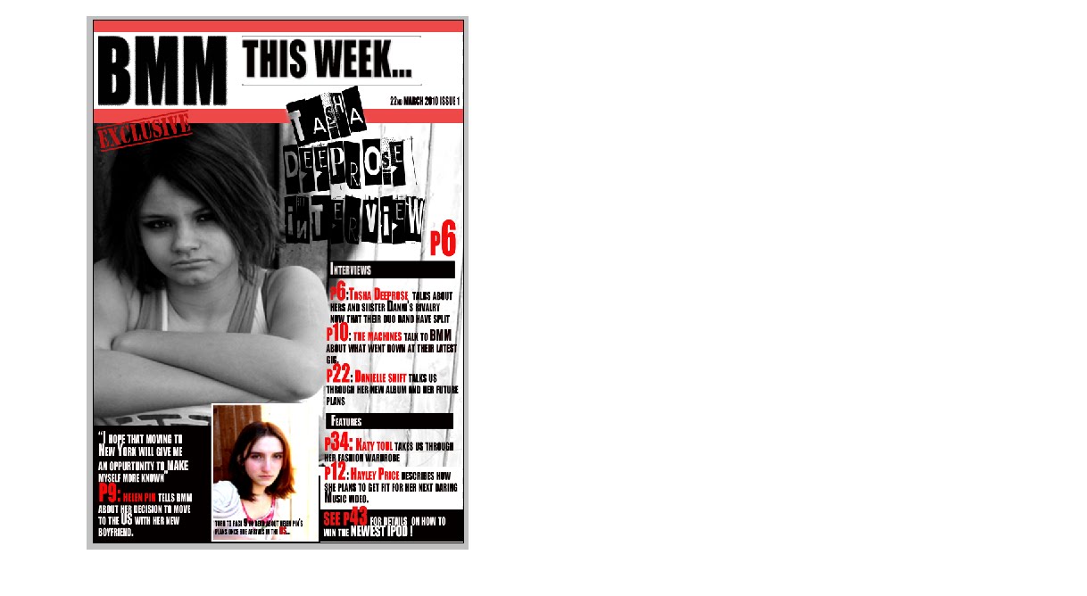
-My magazine front cover also contains a main image which is similar to most mainstream music magazines already existing.
-My front cover has a main headline quote to focus on which I found also included in many other already existing music magazines.
-My double page spread used the typical feature of the 'exclusive' text to lure the reader in to read more. Lots of DPS that I have read and researched use this feature. I also included it in the contents page as well in my final design to persuade the reader into reading further.
-I set out the text in my DPS in columns as well like existing music magazines do so that my reader wouldn't find the text too overwhelming and not bother reading all of it.
How it developed them...
-Some music magazines I researched only kept their brand identity and colours on the front cover. I developed this by developing throughout all 3 pages, keeping the white,black and pink shade consistently shown in all.
-Some music magazines also only keep the feature of pulling out quotes from the text inside the DPS whereas I decided to develop this and include it on the front page as well. It was also taken slghtly out of context as well deliberately to make the reader more curious about the storyline and therefore more eager to turn the page.
How it challenged them...
-On the front page instead of following the typical codes and conventions for camera angles, I decided to do the photos with the model looking down and making no direct mode of address with the reader. In most existing music magazines the music artist/ subject is making eye contact with the reader to give it an intense atmosphere, with there being a relationship almost between reader and the artist. However, by not making eye contact with the reader, I hoped to get the atmosphere where the reader thinks that perhaps she is not looking at them because she has not spoken or made any relationship with them yet, either because she is new to the music industry or that the music media has attacked her with rumours etc and she doesn't wish to speak out. This heightens the story, making the reader more curious and excited about what they are going to read inside because it says that it is an 'exclusive' article. So in this way, I am going against normal conventions.
-I have also not put any other images on the front page apart from the main one. Most magazines have at least one other image on the page to focus on but for mine I wanted it so that the reader focuses only on the main artist in the centre of the page. This would give the reader the feeling that this artist is somehow very important and that they should be reading about them.
Saturday, 17 April 2010


Feedback I got...
Feedback and comments I got back from my target audience/school friends when showing them my pieces:
For the contents page:
"good brand identity colours used, links it back to the front cover and DPS well"
"the main picture is a bit pixelated"
"the font is a bit difficult to read in places"
" a caption could be put underneath the smaller picture to give it more information"
"main picture is unclear"
Most of the comments that I got back from the contents page linked back to the pixelation of it and how unclear the image seemed.
For the front cover:
"an issue number could be included to make it more realistic"
"the title could do with some work to look more professional"
"some of the text is a bit pixelated for some reason?"
Again, most comments I got back referred to pixelated text and images. I need to look into this when I go to improve my pieces.
For the DPS:
"think about putting in page numbers to make it more realistic"
"think about changing the 'exclusive' text, editing how it looks"
"good colour use to link it back to the other pages"
I think the main thing I need to look at here is why my images are pixelated. You can read about this and my improvements in my folder :)
My Drafts of my final pieces


 Here are the print screens of all my first drafts of my front page, double page, and contents page. I designed them all on the program Adobe Photoshop. I am now going to show them to people in the age group of my target audience and see what positive and negative feed back I get. I will then add to my pieces in order to improve them :)
Final preparations for the final pieces...

For the final font for the front cover I found a font on the internet called 'Phorssa' on www.dafont.com and downloaded this. This font was as close as I could get to the font I found on the double page spread. The text above is what I'm using for my contents page main story line. This font is also being used though for my quote on the front cover of my magazine.
Inspiration for some of the features going on my final pieces


For the contents page, I found an already existing contents page that had a feature that I liked because it was bold and stood out as a good title for the page. The above photo of the contents page shows the ' this week' text at the top of the page.
For my front cover, I wanted the quote that I am going to use to be graphic and to make the page look a little more busy but not too cluttered. When I was looking on the internet for inspiration I found a double page spread that used a font for it's main headline that really caught my attention. I then printed these off and gave them to my friends to look at so that I could get their opinions :). They really liked the font idea and said it looks really "graphic" which is exactly what I want for my front cover :). The two pages are above.
Layout of the front cover and mock ups


Now that I have finished the photo shoots I can now begin thinking about the layout of my front cover. I drew them out in rough to give the general idea of how I want my final piece to look. When I gave these to some school colleagues to look at they said that they overall preferred the one on the right, because although they are both purposely quite minimilistic designs, they said that the left one perhaps is too empty. With the main image being the background on my front cover, this will leave the white background for the other text to go on, which will make the cover more neat and less 'busy' which was what my other front cover was described as.Therefore the mock up on the right hand side is what I will be basing my final layout on.
Subscribe to:
Posts (Atom)